
Smart Farm Tools (SFT) is a Seattle-based startup building products for small farms and home gardeners. Their goal was to create a single app that allows users to monitor soil quality, control watering devices, and manage their gardening equipment, consolidating multiple disconnected apps into one intuitive experience. I was brought on as the sole UX and product designer to define their brand and design the accompanying app, including light interactions and animations.
Users of existing gardening tech often have to juggle multiple apps, each tied to a single device. Early feedback from product testing indicated that users primarily wanted to water their plants remotely and track gardening finances, such as buying seeds and selling produce. When I joined, SFT had no design system beyond a logo, and the brand had no visual language, leaving the product with a fragmented identity.
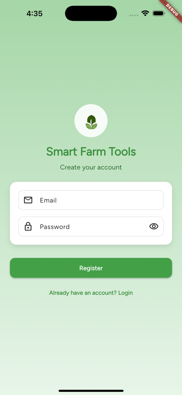
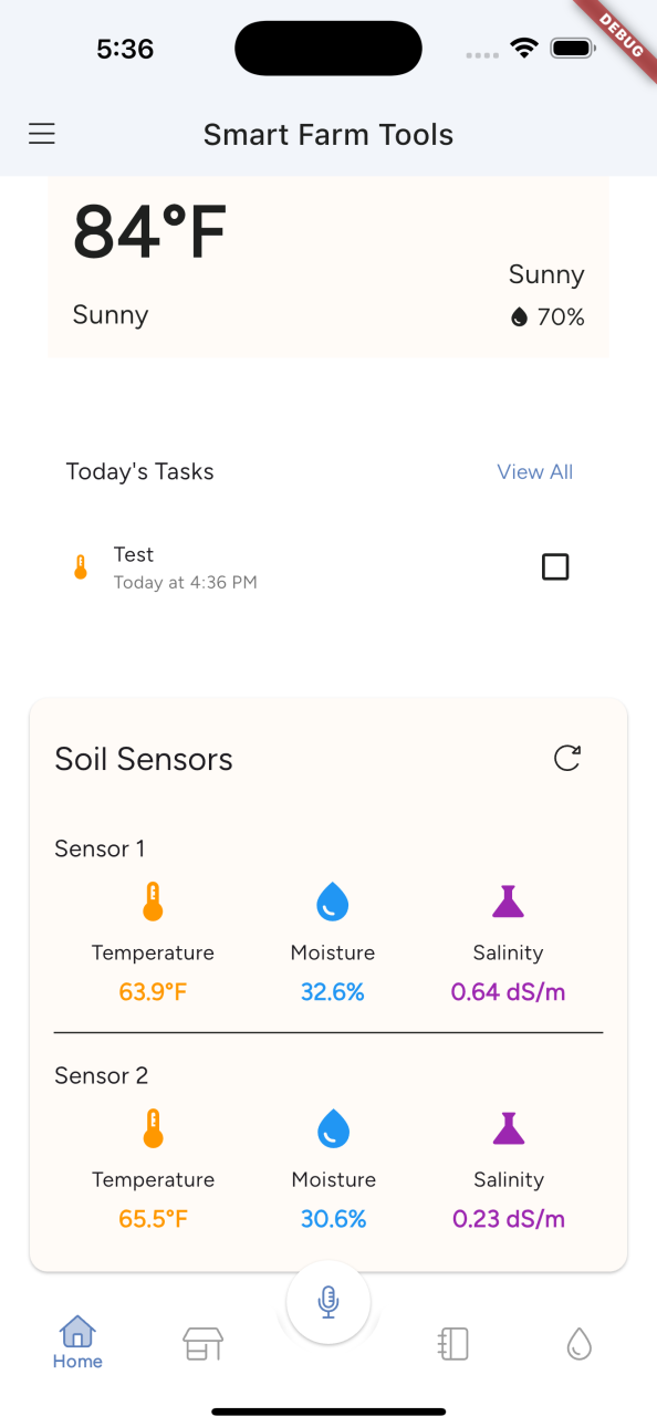
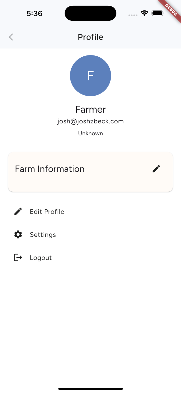
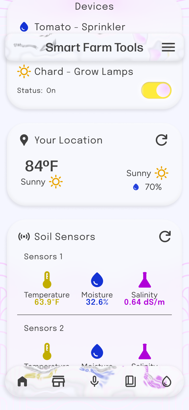
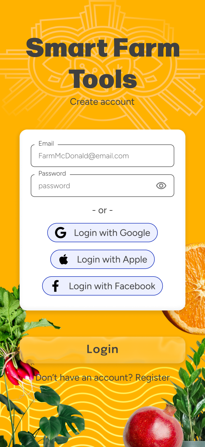
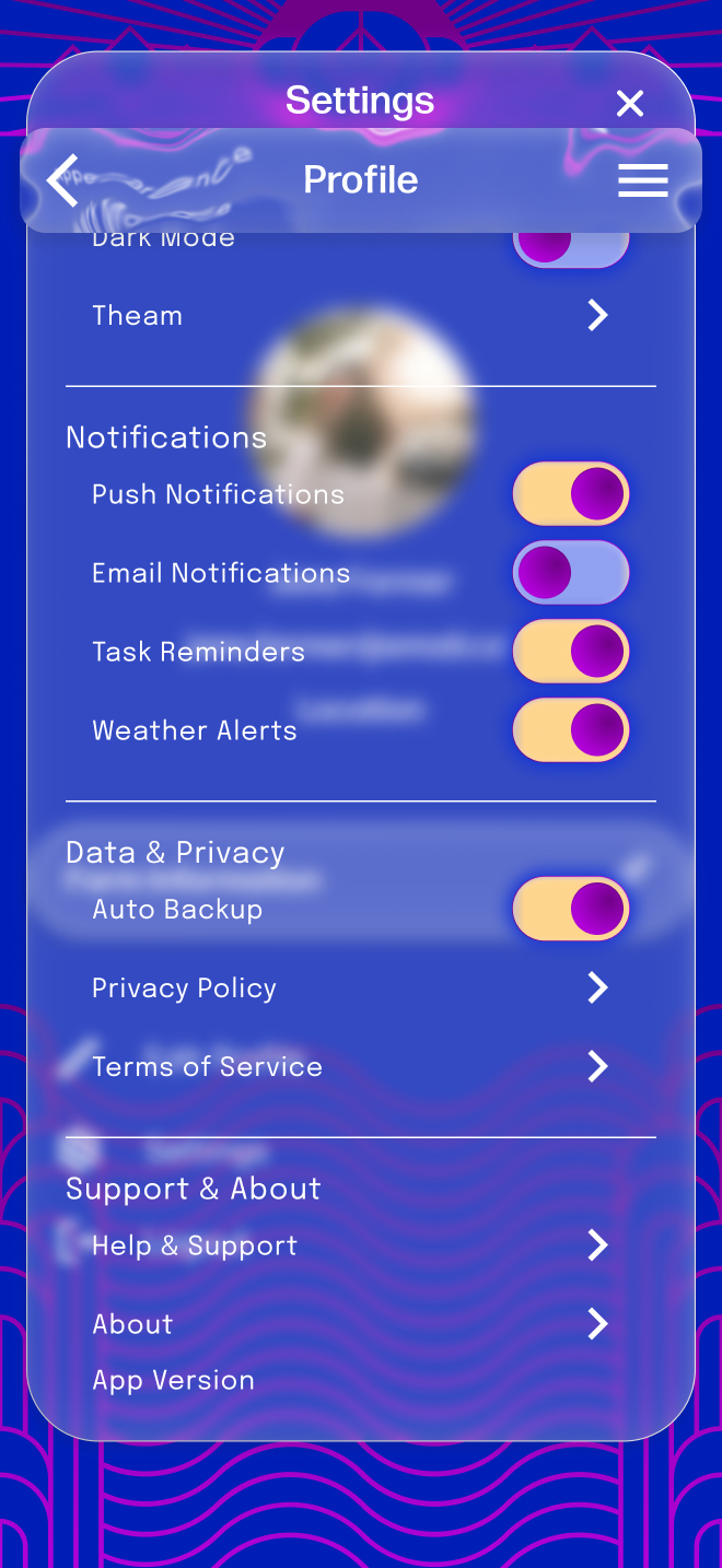
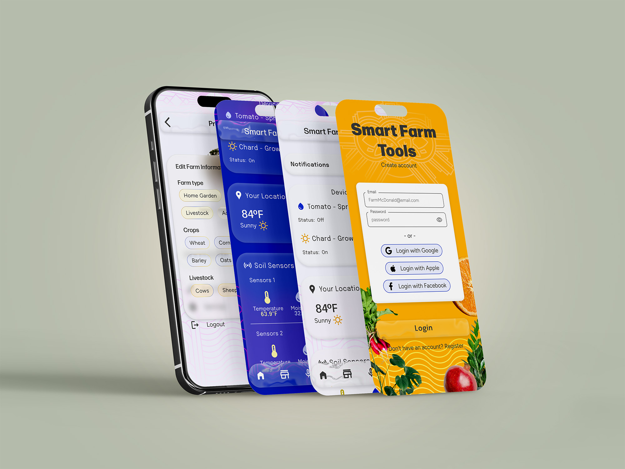
Original demo screens for Smart Farm Tools companion app
I was responsible for both UX and branding, which included:
I worked mostly independently under strict time and budget constraints, limiting billable hours to 3-4 per week. Despite this, I delivered a cohesive brand and app experience.
Tools used: Figma (desktop & mobile design, prototyping), Adobe Illustrator, Adobe Photoshop, Adobe After Effects, Rive
The primary audience was home gardeners and hobbyists (ages 30–50), with small farmers as a secondary audience. Users needed a balance of technical comfort for initial device setup and intuitive design for daily use. My design approach prioritized simplicity, clarity, and familiarity, so users could manage their gardens quickly without feeling overwhelmed.
User Insights:
Competitive Analysis:
Brand Prompts:
Constraints:
Brand & Visual Language:
UX Decisions:
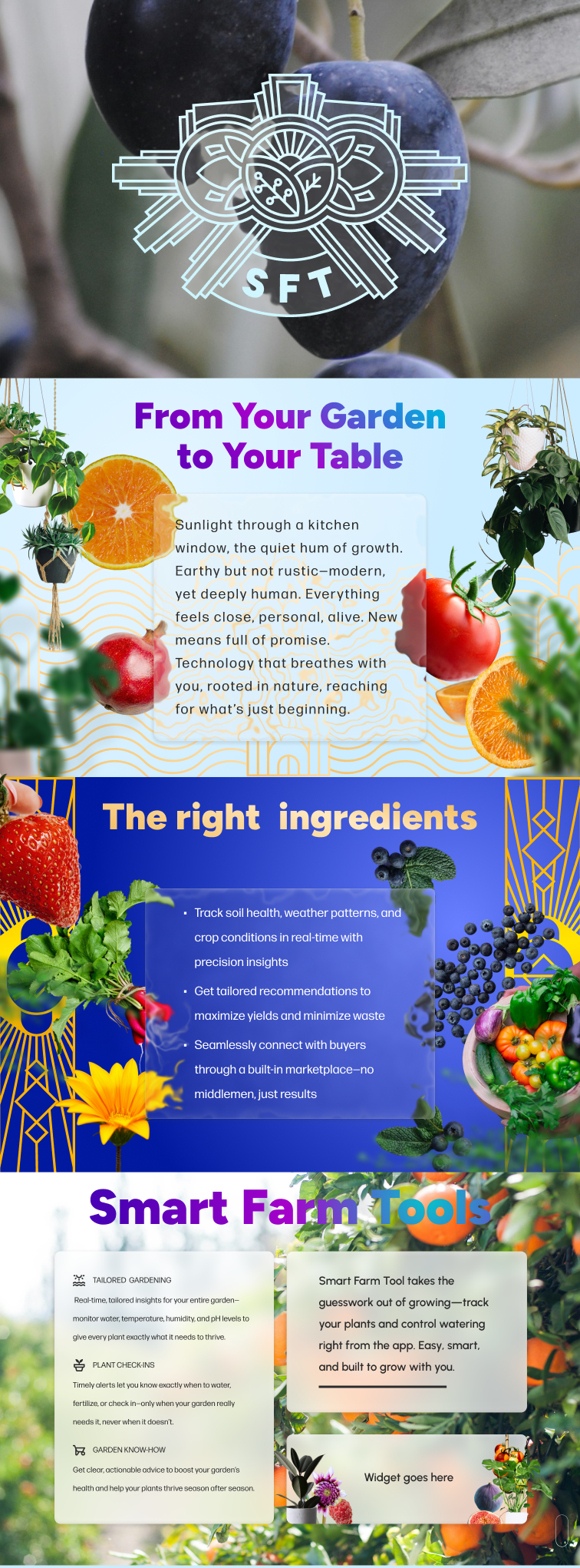
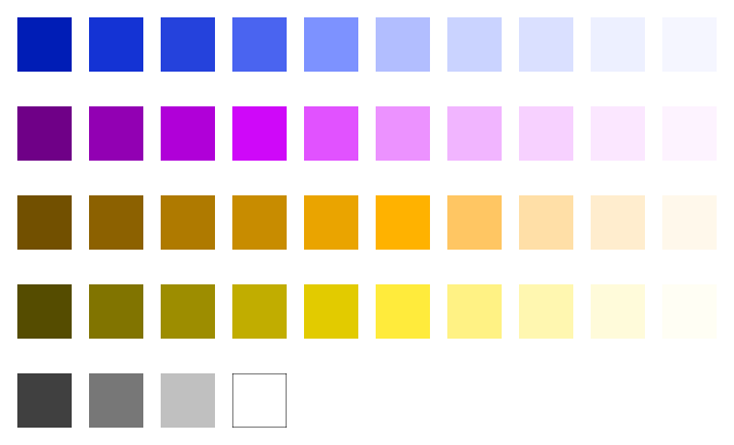
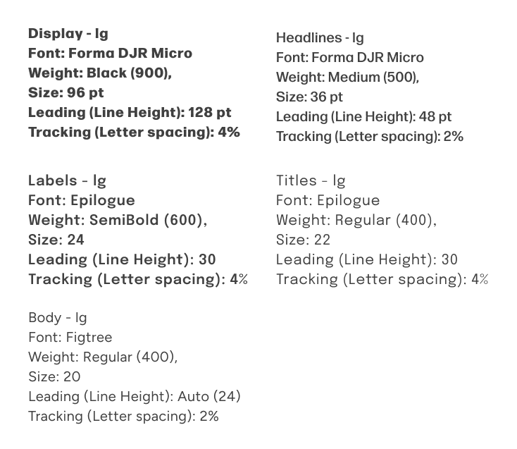
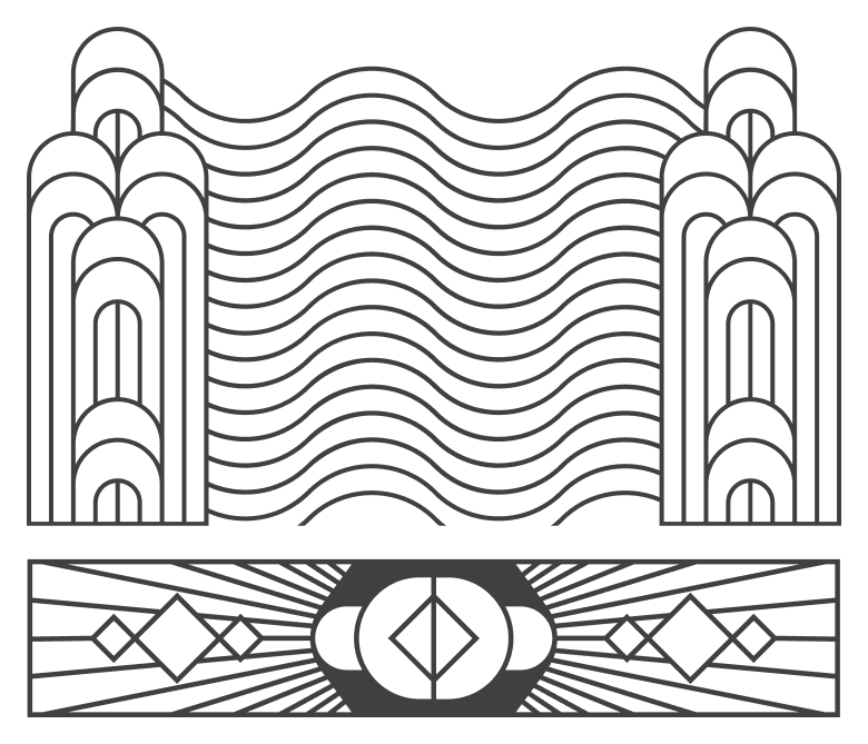
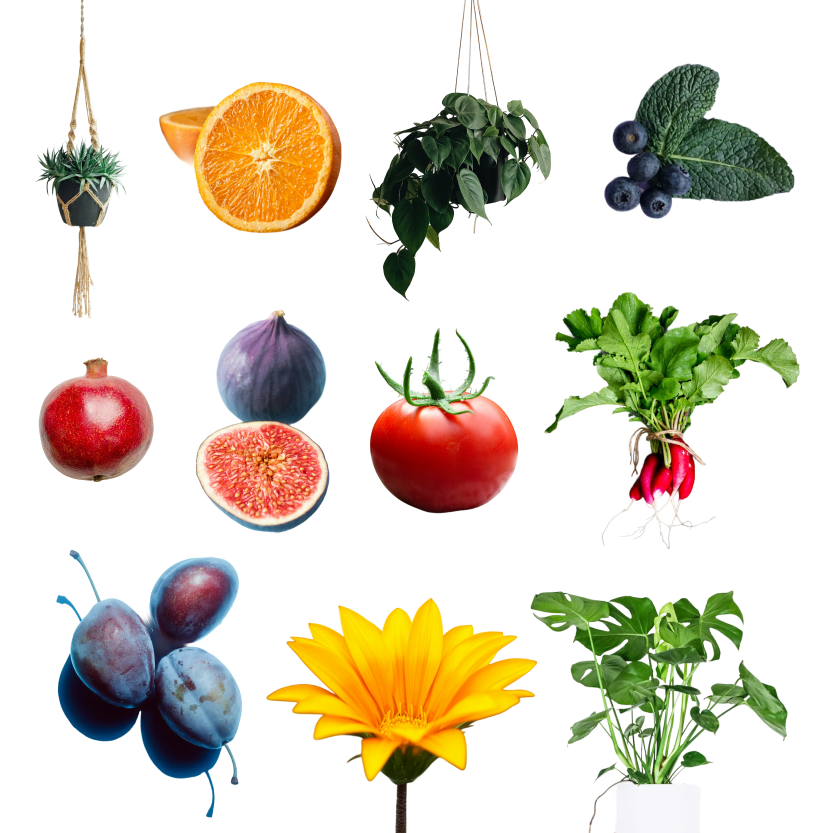
Brand colors, font styles, patterns, and images.
Metus pulvinar hendrerit eget consectetur ipsum arcu adipiscing ullamcorper accumsan adipiscing condimentum vestibulum parturient ad condimentum rutrum semper.
As Smart Farm Tools prepared for launch, one of the key challenges was communicating a connected ecosystem of products in a way that felt simple, engaging, and easy to understand.
I led the creation of motion assets that translated complex product functionality into clear, visually compelling stories—used both in-product and in Kickstarter campaign materials.
Microinteractions & Product Experience
In addition to marketing assets, I designed motion elements directly within the product experience to create a more polished and engaging interface.
This included:
These details helped establish a sense of personality and continuity throughout the experience.
Animated logo used during app launch to establish brand personality and create a welcoming first impression.
Loading state where grass grows and gently sways, reinforcing the product’s connection to nature and real-time growth.
Animated Infographics for Kickstarter
To support the Kickstarter campaign, I created a series of four short animations highlighting:
Each animation focused on quickly communicating value without overwhelming the viewer.
Simplifying Complex Information
The core challenge was making technical features feel approachable.
I solved this by:
This approach allowed users to scan and understand key features within seconds—critical for maintaining engagement on a Kickstarter page.


This ensured consistency across both product and marketing experiences.
Explaining the Ecosystem
One of the most important pieces was showing how the products work together as a system.
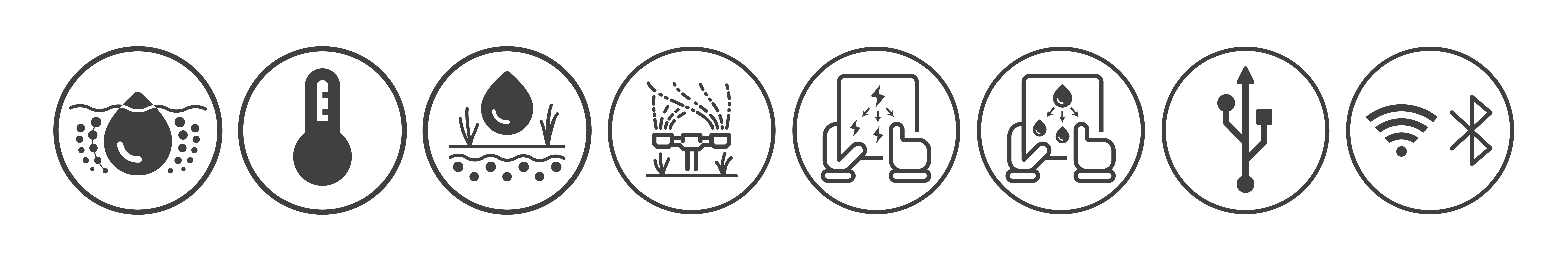
I created a dedicated animation that visualized connectivity using:
This transformed an abstract concept into something intuitive and easy to understand.
Caption: Visualization of how the soil sensor communicates with the hose hub and power strip using simple connectivity cues.
Motion as a Communication Tool
Motion was intentionally used to guide understanding, not just add polish.
This made potentially dry, technical information feel dynamic and engaging.
I delivered:
The designs were implemented by the app builder, and I received iterative feedback over weekly meetings. The team moved forward with Kickstarter planning, although the project seems paused at the time of writing.
I’m proud of how I translated abstract brand directions into a cohesive, playful, and usable design system under tight constraints. The dashboard, login, and finance screens effectively solved core user problems and balanced personality with usability. If I were to revisit this project, I would refine user flows and scenarios further, but overall I’m satisfied with how the app and brand came together, creating an intuitive and visually engaging experience for home gardeners and hobbyists.