
Wayber is a Seattle-based startup that uses AI to help people buy and sell homes more efficiently, saving them thousands of dollars in costs, fees, and overhead in the process. I was hired as a freelance UX/UI designer to redesign their marketing website, with the goal of increasing traffic, boosting engagement, and converting visitors into customers. Over the course of six months (and ongoing), I worked independently to audit, rewrite, redesign, and prototype the full site experience across desktop and mobile.
I was hired as a freelance UX/UI designer to lead the entire redesign. I worked independently, with no additional designers or stakeholders involved during the process. Once the design phase was complete, I handed the files off to one of the co-founders for development.
My responsibilities included:
Tools used: Figma (desktop & mobile design, prototyping)
Wayber’s original website outlined their AI-powered real estate service but failed to clearly explain its value. Beyond the homepage, the site lacked cohesion, visual consistency, and user-friendly language. It leaned heavily on technical jargon and minimal imagery, making it difficult for users to understand the benefits or feel confident engaging with the platform.
Key pain points included:
Without access to direct user interviews, I conducted a competitive analysis of other real estate platforms like Redfin, Zillow, and Homecoin. This gave me a strong sense of what users were likely to expect and where Wayber was falling short.
The key insight: the site lacked a clear, trustworthy identity. Unlike its competitors, Wayber’s visuals and messaging didn’t inspire confidence or encourage exploration.
This insight shaped my focus on clean, consistent design and language that told a story rather than overwhelmed with information.
The key insight: the site lacked a clear, trustworthy identity. Unlike its competitors, Wayber’s visuals and messaging didn’t inspire confidence or encourage exploration.
Wayber already had a general sense of the content they wanted to present. My job was to reorganize and reframe that content so it would make sense from a user perspective.When I started wireframing, it was obvious the biggest challenge was the prompt builder menu.
My design principles were clarity, simplicity, and trust.
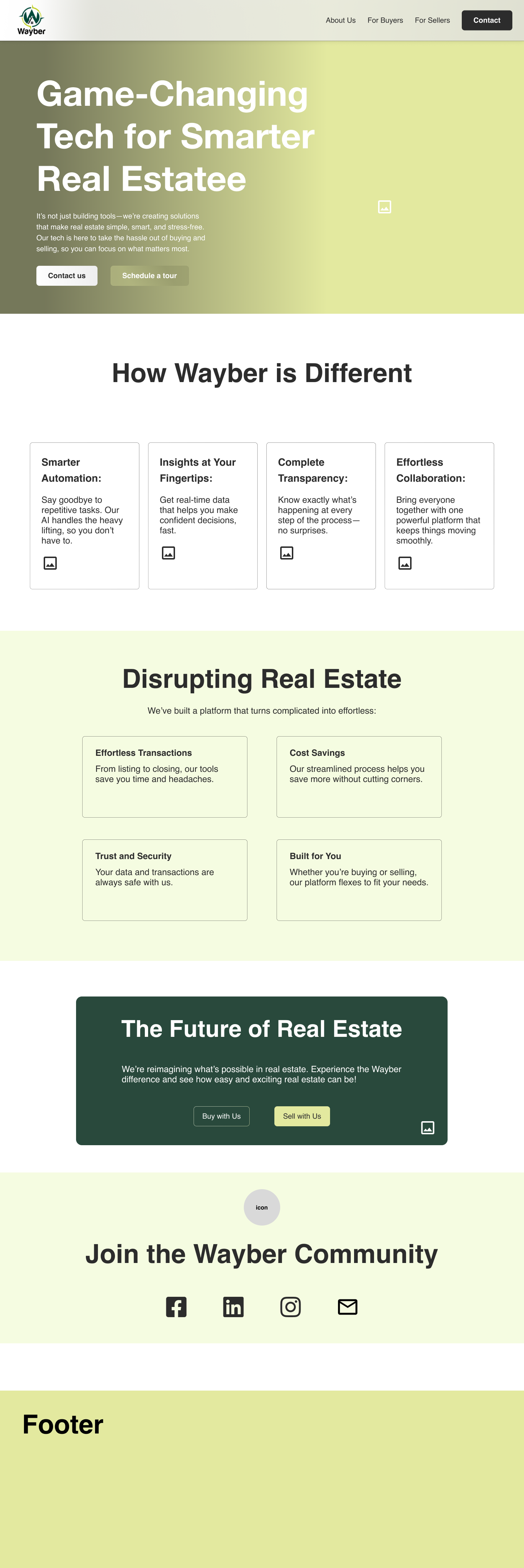
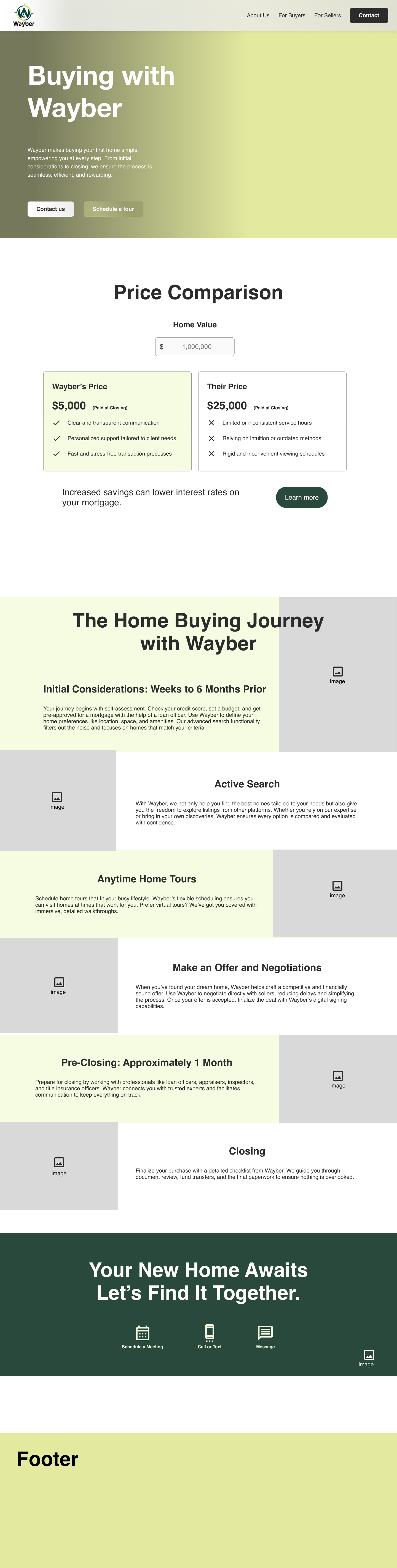
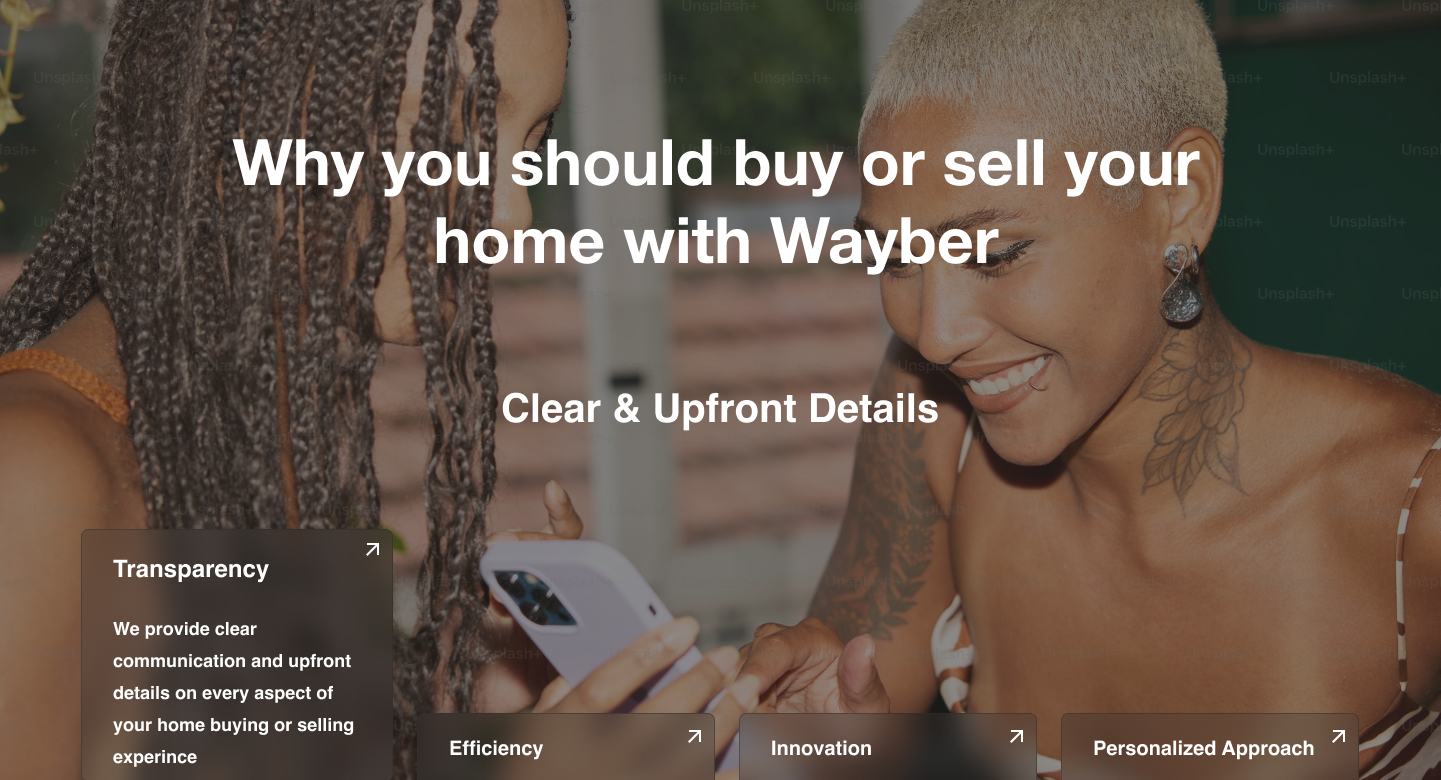
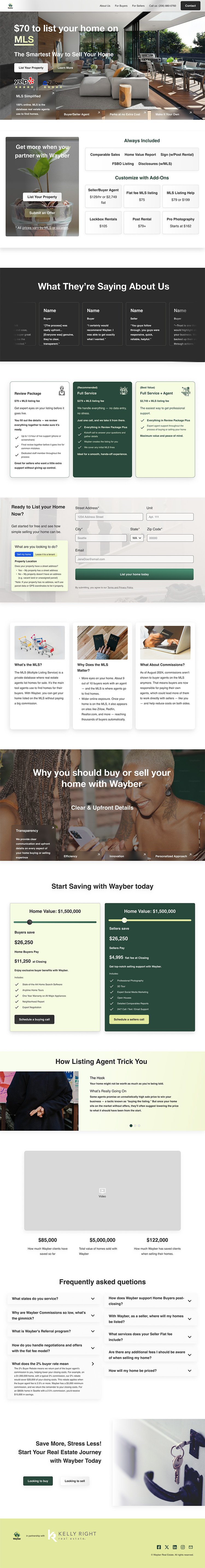
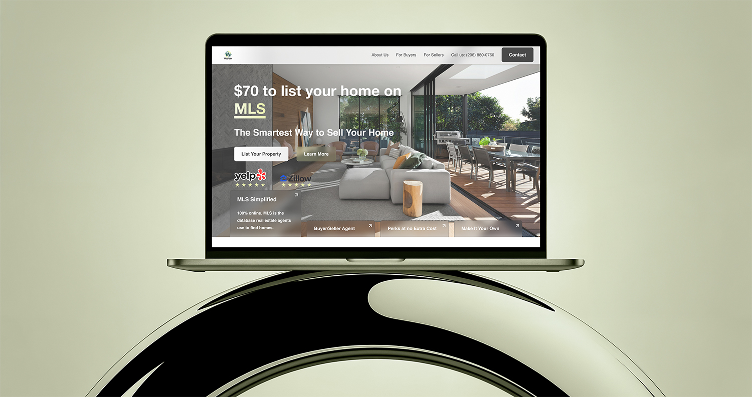
I redesigned every major section of the site. Hero sections were particularly important, they needed to immediately communicate value and invite the user to keep scrolling.
Visual system:
Design highlights:
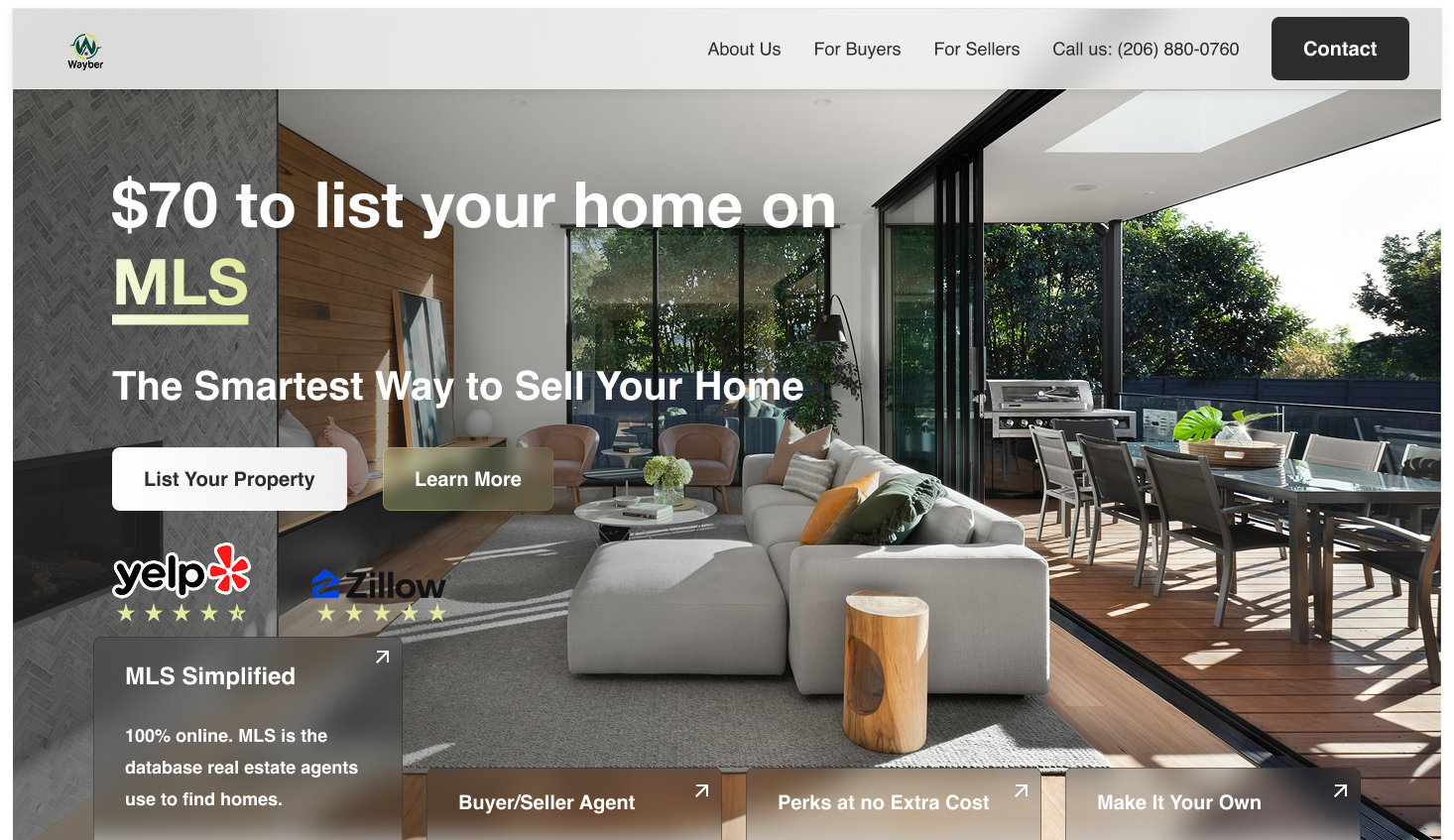
There was no formal testing or feedback phase, but I was brought back a few months later to redesign the homepage with a greater focus on sellers, a strategic business pivot.
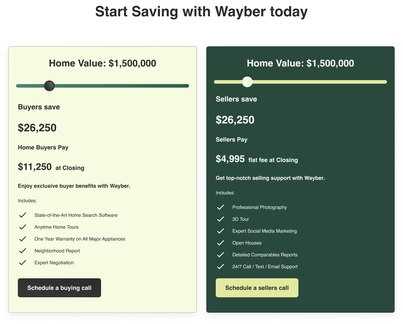
In that second round, I refined the messaging and layout to prioritize seller-specific benefits while reusing and adapting existing components. The shift helped further align the website with Wayber’s target market and marketing efforts.
Before after screens for version 1 and version 2 of the Wayber home screens
Hover to see full screen
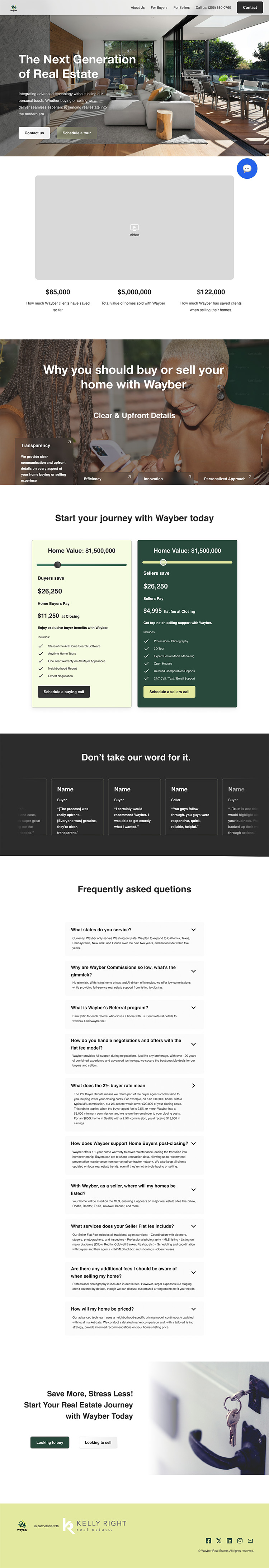
Both rounds of the redesigned website launched successfully, and the second version remains live. After the first version went live, Wayber achieved its first-ever conversion from a website visitor to a paying customer, a major milestone for the team.
The founders described my work as “a lot better” than what they had before and have continued to bring me on for new pages and features as they expand the site.
What I’m proud of:
What I’d do differently:
This project was an opportunity to take full ownership of a product’s UX and visual identity, working directly with a startup to help them grow. By combining UX strategy with visual storytelling, I helped Wayber move from a disjointed website to one that builds trust and drives action.
Wayber’s story is still being written, and I’m proud to continue helping shape it.